
A design guide that benefits EFI desktop/web products, communications, people, and businesses.
EFI Design System
Overview
Client Name
Project Name
I was assigned to redesign EFI's ERP solutions (which were mostly acquired as small companies/startups) along with a small group of designers. It was obvious to us that the design aesthetics, interaction patterns, and usability were incredibly fragmented. Most of them were going through technology upgrade with the redesign. We felt the need to have a common design style guide, which would help us make fast improvements and maintain consistency across the product line.
A preliminary glance at the design style guide activity, initiated by the design team, made it evident, to us and the dev. teams, that it was crucial to have common components that followed a style guide that would help make rapid progress on the redesigning. So, a small group of members from different functional teams came together to build an initial html/css library.
In the beginning, I was just a contributor, like other team members, but a special interest in the topic & knowledge about front-end technologies gave me an opportunity to lead this initiative... (and earned me a new title "DOT father":-)). I really enjoyed working with a team of multi talented people and understood what it takes to build a good design system using real world examples.
The initiative was greatly appreciated by the global marketing, support & business teams as it helped build a product faster and achieved consistent experience across the EFI eco system. The design team also earned the ‘Best Team of the Year 2018’ award for initiating this exercise.
INVOLVEMENT
-
Research
-
Strategy
-
Planning
-
Design + Execution
-
Management
-
Coaching
DATE
Feb 2017 (9 months)
Updates are on going activity
CREDITS
EFI design team, Component dev team
LINK
Client Name
THE NEED
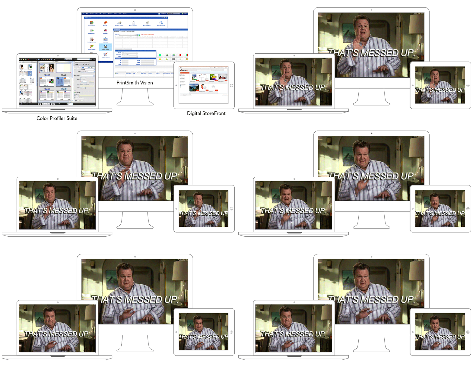
UX & Design Debt
An EFI (acquisition+internal) product line with fragmented and disconnected experience
- Designers re-invent the UI styling for every product
-
Minimal to no design documentation or specification
-
Disparate components across all lines of products
-
Multiple teams and a variety of UI frameworks involved
TEAM COLLABRATION
Understand The Scope
Analyze EFI products and eco-system

Order acquisition, Marketing, Estimating, Planning, Scheduling, Job Preparation, Manage Inventory
Fiery CommandWorkstation, Job Properties, JobExpert, JobFlow, Color Profiler, Spot Color, Image Enhance etc.
Finishing, Fulfillment, Billing/Payments, Shipping, Delivery, Production Analysis, Reporting
EFI products UI audit
-
Examine clutter & inconsistencies with applications, platform, and device
-
Audit interaction patterns in the key products
-
Evaluate outdated tech implementation challenges
Defining principles
-
Establish guiding principles to help set a better foundation
-
Conducted few dedicated workshops which helped us to create high level draft principles
-
Warm-up exercises to empathise with dev. teams to understand the current challenges of design delivery
Organization On-boarding
-
Drafted the design guideline approach, benefits, challenges (based on initial discussion & workshop with internal teams)
-
Presented ideas to the key members in the organization
-
Acquired an initial buy-in and support for the Beta version kick-off

"Everything starts from a dot"
Wassily Kandinsky, Bauhaus
We wanted to have a strong "Metaphor" for our design language - one that all of us could relate to in the printing realm and enrich the EFI brand - the "DOT", the most fundamental and organic matter that gives life to all printed images.


BUILDING BLOCKS
Adaptable Model
The right foundation - the Atomic design methodology (by Brad Frost) helped us identify building blocks clearly and compose five distinct levels: Atom- Single element, Molecules- Group of UI elements, Organism- UI Component, Template-Page layout, Pages- Interaction model.
This was helpful in design documentation & communicating the structure to developers, as it's far easier to explain design system and its behaviour across screen sizes and device capabilities. It is also a handy analogy in explaining HTML development to non-technical people.
ORGANISE DESIGN DELIVERABLES
Design kit - Sketch Library

Initially we created a draft of a visual style-guide with group of designers. The style guide included accessible colors, scaling typo, spacing, icons, grids & shadows etc.
The style-guide gave our work a unified direction, while allowing other designers to explore and discover. Our focus was to start with intent and not just building a library. We strived for the right foundation, with design principles, human interaction, behavioral aspect, & usability. At every new proposition we reviewed, discussed and spent time examining how different patterns emerged.
The design kit improved our overall design process, increased efficiency, and enhanced the product's design consistently, which in turn improved usability. We saved time, communicated design ideas more effectively, the product team/stakeholders were happy with new design ideas being finalised in the matter of a few hours.

The example shows updating a simple app page, but these principles can be applied to any system component and even larger patterns. The idea is to provide quick and easy access to all components, and all of their states.
RAPID DEVELOPMENT - PROTOTYPING
UI pattern library

The development too adopted the Atomic design methodology – ‘Design tokens’ as atom of the system and simple CSS style properties as hard coded values to ensure a better visual consistency across product. UI elements built on design token, for e.g. a button or an input box; UI Patterns that fall on a more complex side of the spectrum, for e.g. a date picker or a data table. Patterns utilize both elements and tokens and finally templates that exist to document the layout and structure of a section. Page templates consist of the three things mentioned above: tokens, elements, and patterns.
The dev. lead architect created comprehensive docs with Git repository. The docs show where the system pieces live and how to begin building components. While a part of it is still in progress, this was a good start for other product dev. teams to build rapid prototypes and prevent them from duplicating work that costed both time and focus. It helped remove unnecessary dependency and allowed developers to leverage the components. The pattern libraries are kept in raw format, so it can easily absorb any front-end platform or framework.
A SOURCE OF TRUTH — A REFERENCE POINT
Documentation
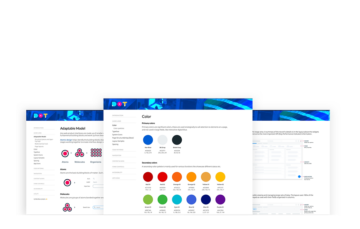
During the design kit creation we started a rough living documentation. The documentation includes our design principle, type scale, color guidlines and spacing usage with additional prototypes. We keep updating this space, so everyone can find all the answers and benefits of design system- from the most junior to senior members of any teams, and of course, is great for onboarding new team members. Below is a high-level summary of what the initial documentation:
We explored many platforms that could be suitable for the system documentation. We found Frontify platform was suitable. You will find the initial (BETA version) documentation here: https://tinyurl.com/zcdnh6m. The future versions were maintained on the EFI's internal platform due to some company policy demand.
RAPID DEVELOPMENT / PROTOTYPE
Adaptation & implementation

THE TEAM
Planning & execution

After the successful launch of the DOT system's Beta version, we realised we need to maintain it to keep it alive and relevant. Any changes made across the system affects the teams and areas of design kit, documentation, Html/css, Angular component repository, etc., so the changes have to be kept visible across teams.
The Trello board helped us plan this better. I created buckets to keep track of new updates. It helped us allocate time/scope better, encouraged teams to submit new requests/suggestions, and since most contributors were working on their tasks voluntarily, this helped them keep tab on progress.
IMPACT & LEARNINGS
A way forward

Since its creation, more than 20 app services adopted the standards & component library. This really inspired & motivated the team to make the required improvements and add best practices to the all the main components. It is, of course, difficult to establish a quantified result as some parts of the components are still in progress. So far it has helped speed up many aspects of the design process and think of it as a success since many new dev. folks have come forward with their contributions and lent a helping hand in its development. Our work has created a solid foundation for many future deliverables.
Design systems are not a one-size-fits-all solution, so we believe it's always evolving and improving. We also continue to spread the word across using different innovative ways. In the process of scaling UX within the company, we find that design systems are a way to make UX tangible to teams and to make EFI brand values actionable.
The Design System best practices have emerged from many examples we followed, thanks to organizations openly sharing their process, also the communities forum on this topic helped with challenges
